Hi! I’m a Visual Communication Design undergraduate at Binus University. I’m passionate about exploring how visuals can tell stories, evoke emotions, and connect with people. My works combine creativity and strategic thinking to craft meaningful visual experiences across branding, illustration, and digital media.
I’m interested in how design and visual language can shape perception and communicate ideas effectively. Through my studies, I’ve developed skills in design thinking, conceptual development, and visual storytelling. I aim to create works that are not only visually engaging but also thoughtful and relevant.My name is Catherine Sharon Kay, born on August 15, 2005, and I’m from Indonesia.
I’m someone who loves exploring creativity in everyday life and finding inspiration through different forms of art and experience.
In my free time, I enjoy singing, playing guitar, drawing, video editing, vlogging,
journaling, gaming, exercising, traveling, and watching films from various countries. These hobbies allow me to express myself, stay inspired, and discover new perspectives about the world around me.
I believe that creativity grows through curiosity and diverse experiences every song, journey, game, and film adds a new layer to how I see and tell stories through my work.DARMA YUDHA SENIOR HIGH SCHOOL
PART OF ART CLUB
(2020-2023)
BINA NUSANTARA UNIVERSITY
VISUAL COMMUNICATION DESIGN
(2023-2027)#CREATIVETHINKING
#PROBLEMSOLVING
#TEAMWORK
#TIMEMANAGEMENT
#ADAPTABILITYEDUCATIONSKILLSSOFTWARE
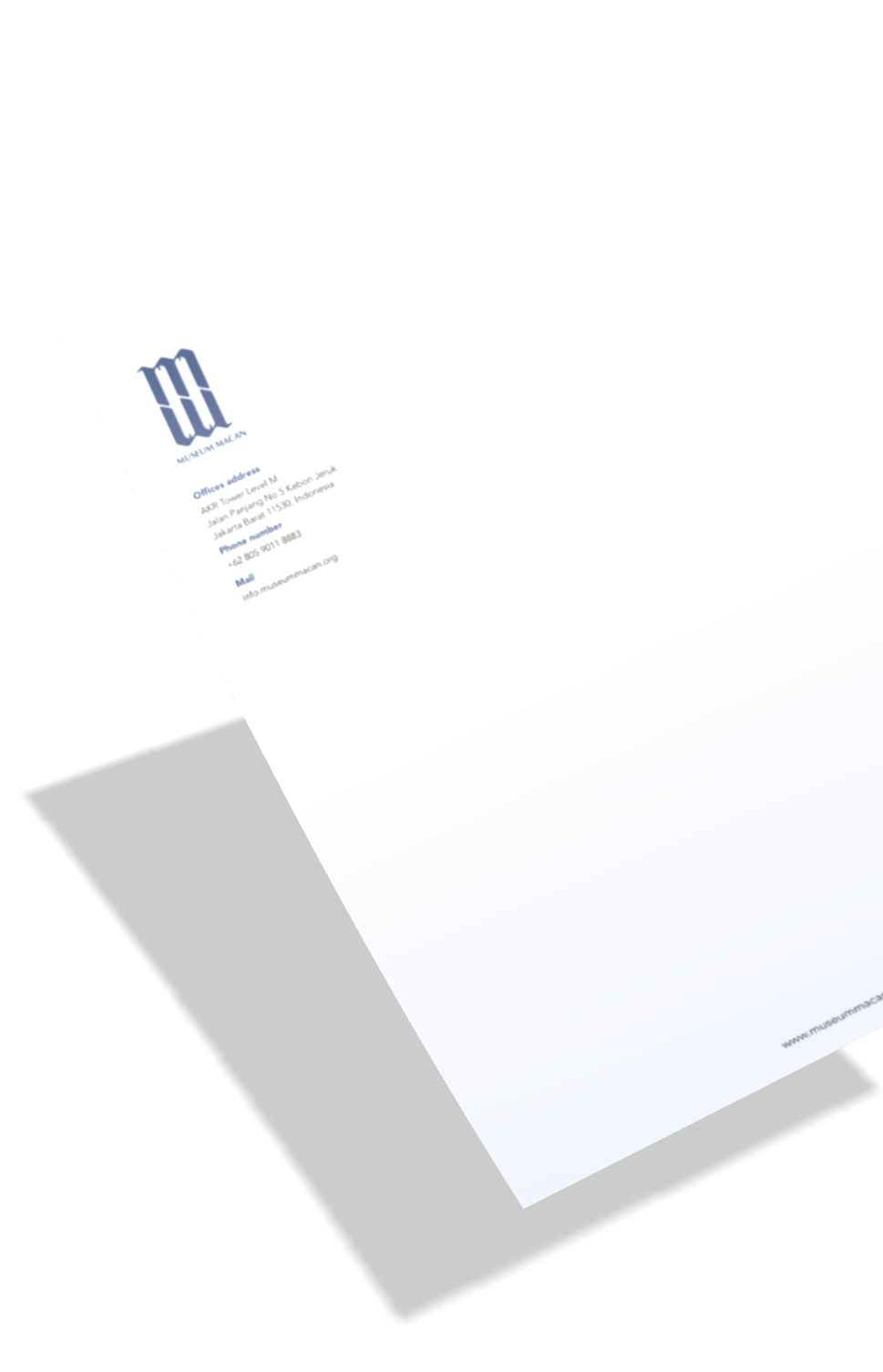
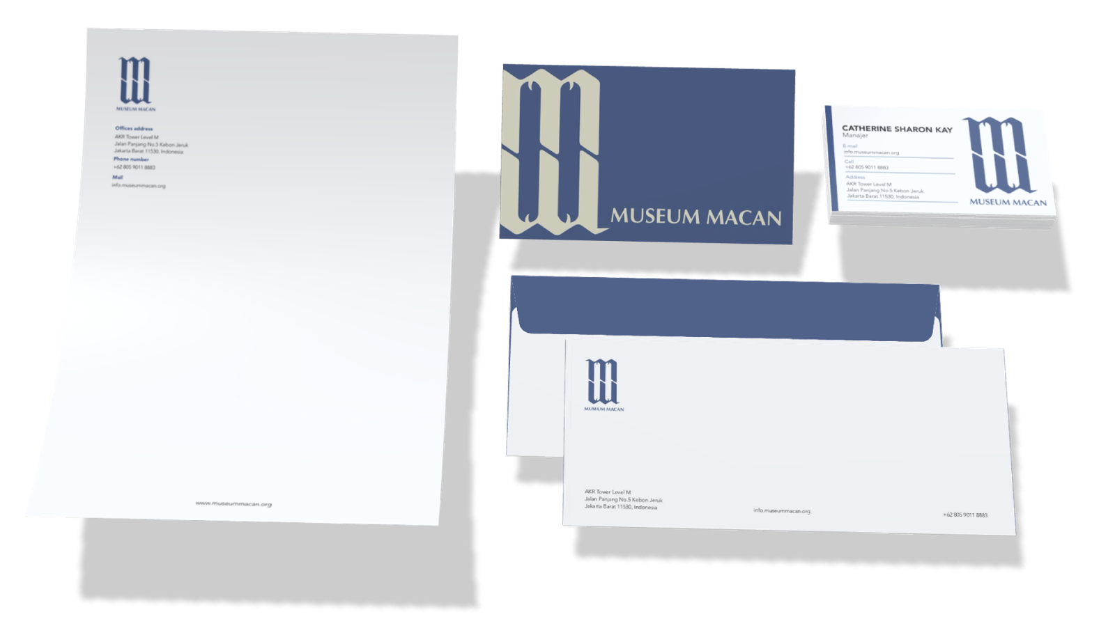
This project presents a branding concept for Museum Macan.
It includes a logo, business card, letterhead, envelope and website design. The design adopts a minimalist yet sophisticated aesthetic, highlighting the museum’s modern and professional character.
The color palette composed of deep blue, white, and cream conveys
elegance, trust, and creativity. A stylized “M” logo serves as the focal point of the brand, symbolizing structure and modernity. Clean
layouts andrefined serif typography reinforce the museum’s
intellectual and artistic spirit.
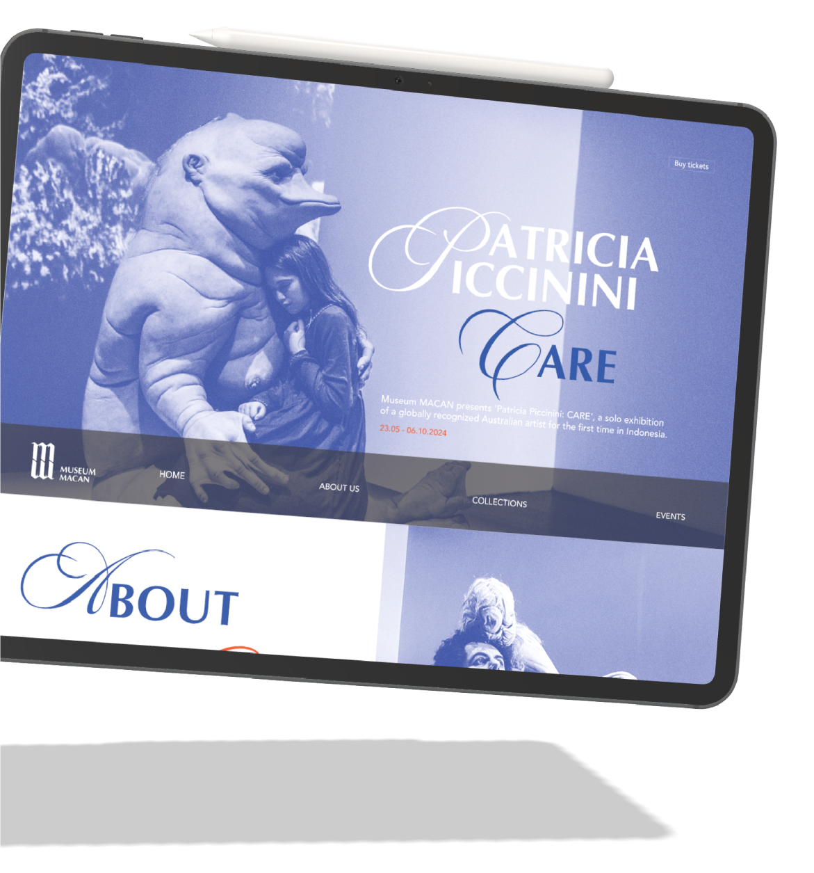
Patricia Piccinini's Care website design
project for the Museum Macan. This design uses typography in subheadings and contrasts with white, navy, and orange.
MUSEUM MACANTOOL | CANVA, PROCREATECOLOUR PALETTETOOL | CANVA, PROCREATE, ADOBE ILLUSTRATORCOLOUR PALETTERIDE THE JOY A GUIDE TO BICYCLESI’M A GRAPHIC DESIGNER
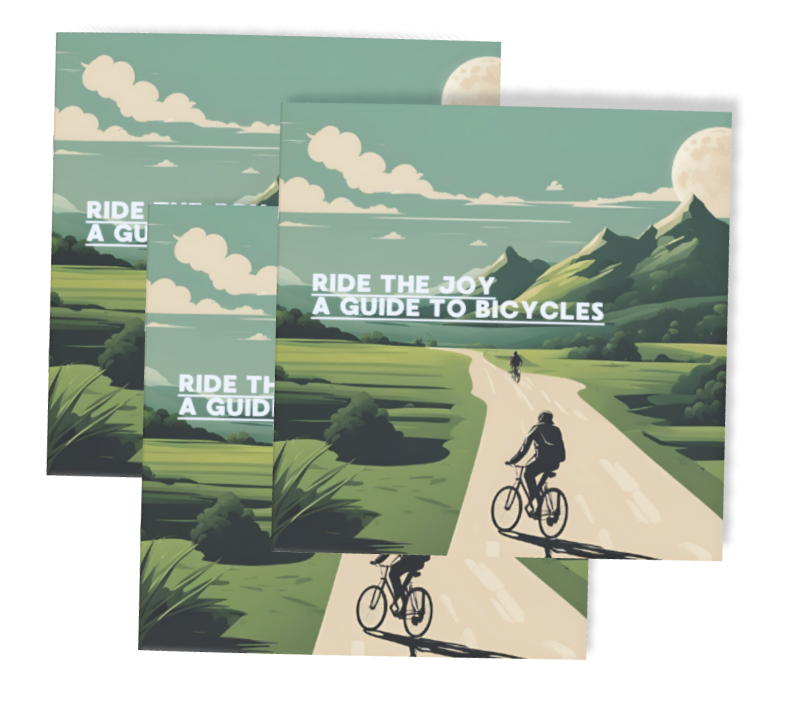
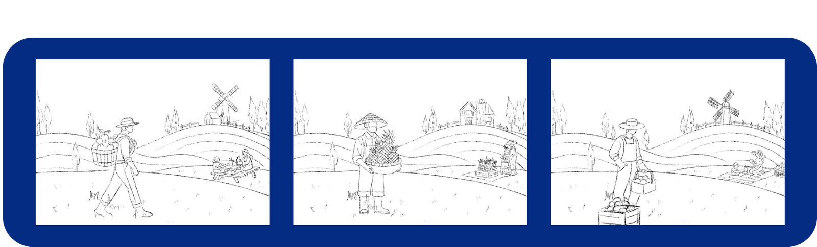
On the cover, we illustrate a cyclist riding along a mountain road, visually capturing the theme of “Ride the Joy: A Guide to Bicycles.” The brochure is designed in A3 size with four horizontal folds and three vertical folds, allowing it to fold down into a compact square. This makes it easy to slip into a pocket. The design prioritizes practicality, especially for sport and outdoor enthusiasts who value convenience, ensuring the brochure is easy to carry without any hassle.
The front page introduces general
information about bicycles, including their different types and brief explanations of each. When opened, the brochure
provides several safety tips for cycling such as wearing a helmet, following traffic rules, checking your bike’s condition, and
staying alert. It also demonstrates how to use proper hand signals to communicate with other riders and ensure safer
interactions on the road.
When the brochure is flipped over, it
presents the main components of a
bicycle, along with clear explanations of each part and the advantages of using a bicycle. It also includes a brief overview of the history of bicycles, and the final
section highlights the essential items needed for safe and comfortable cycling.
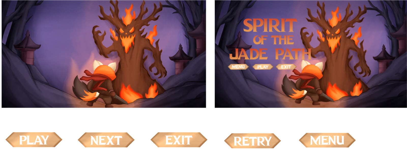
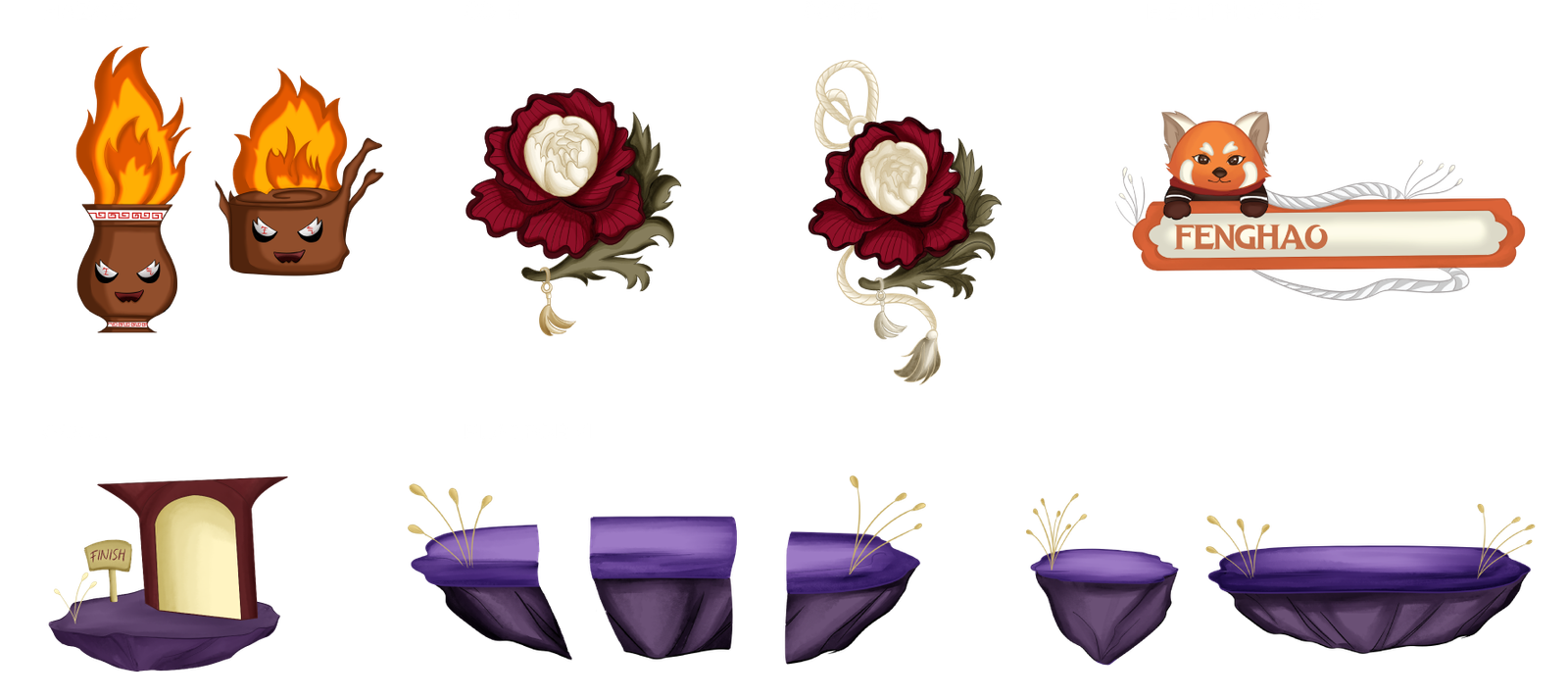
TOOL | CANVA, PROCREATECOLOUR PALETTESPIRIT OF THE JADE PATHCHARACTERASSET2D SPRITE CHARACTERBACKGROUND ENVIRONMENTINTERFACE
In ancient China, the red peony jade symbolized harmony and prosperity. When the Dark Dynasty rose, traditions faded under modern influence, and peace crumbled. Fenghao, a young red panda, witnesses his village’s decline and embarks on a journey to collect jade and restore cultural harmony.
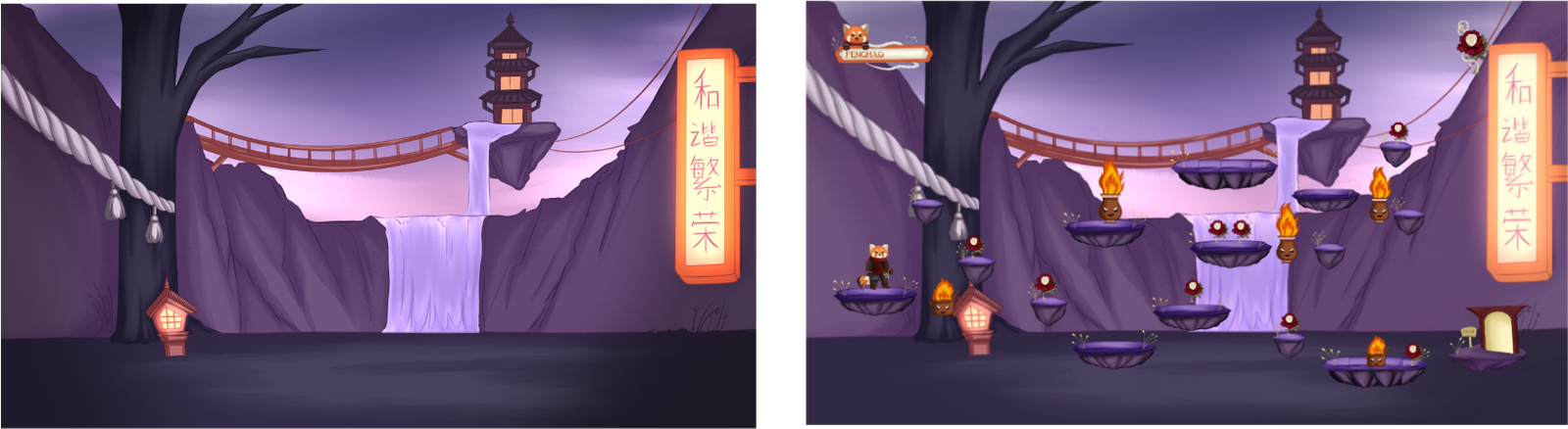
Concept: I Made the background in a forest with a waterfall and some chinese cultural ornaments, and because my game concepts is a associated with the incoming of a new culture and the modern life of today that makes chinese culture disappear. I depicted the new culture with the led lights on the right side, and electrical cables as a symbol of today’s life, there is a wooden bridge crossing from the left side to the right as a symbol of time flowing from ancient chinese culture that is increasingly leading towards foreign culture.
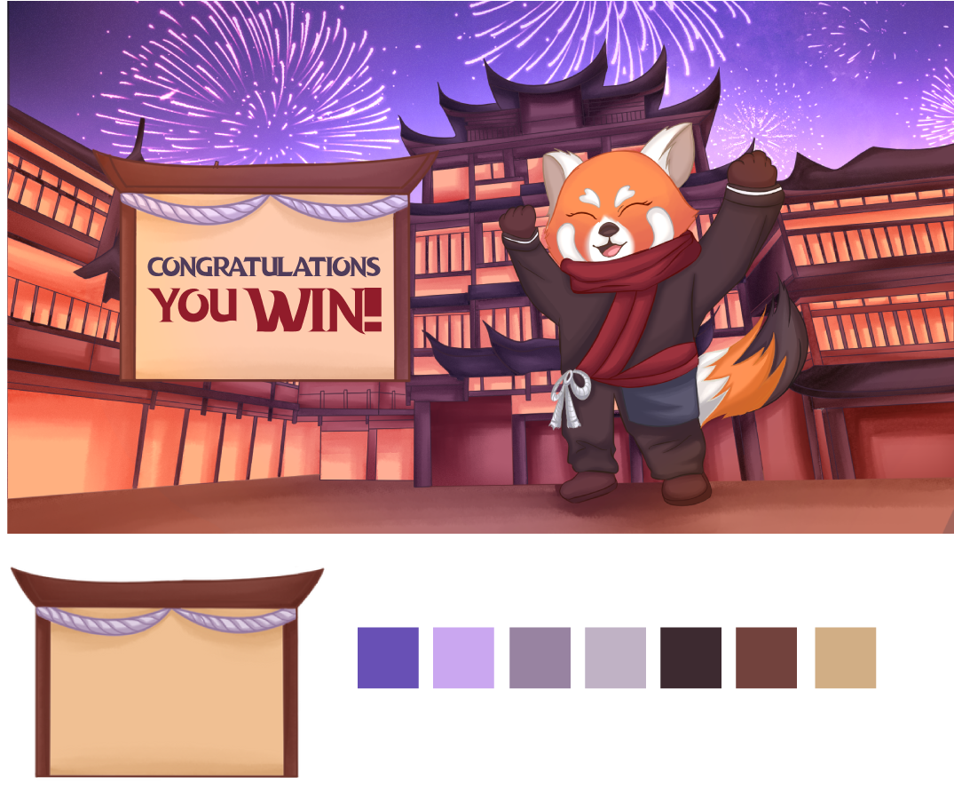
I created the background with a festive atmosphere to show victory with fireworks and happy looking characters. This scene is a formof celebration of the culture that has been acquired after winning the game at each stage by returning items that are the key to chinese culture that has disappeared.
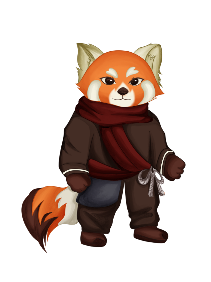
Fenghao, I chose the red panda as the main character in this platform game because it represents the small, often overlooked, yet incredibly important things. It's not an icon of strength, but rather a symbol of balance and perseverance, much
like traditional cultures in everyday life that quietly maintain harmony within families, communities, and nature. Fenghao is a red panda because the world needs small, courageous, caring individuals. And in this game, players are encouraged
not only to fight but also to remember and nurture the values that shape their identity.
Furthermore, I chose the red panda because it represents a contemporary symbol, as the red panda, a native animal of China, has recently become increasingly popular with modern people.
TOOL | CLIP STUDIO PAINTS, ADOBE ILLUSTRATOR, UNITYCOLOUR PALETTE
Home
About
Projects
Contact
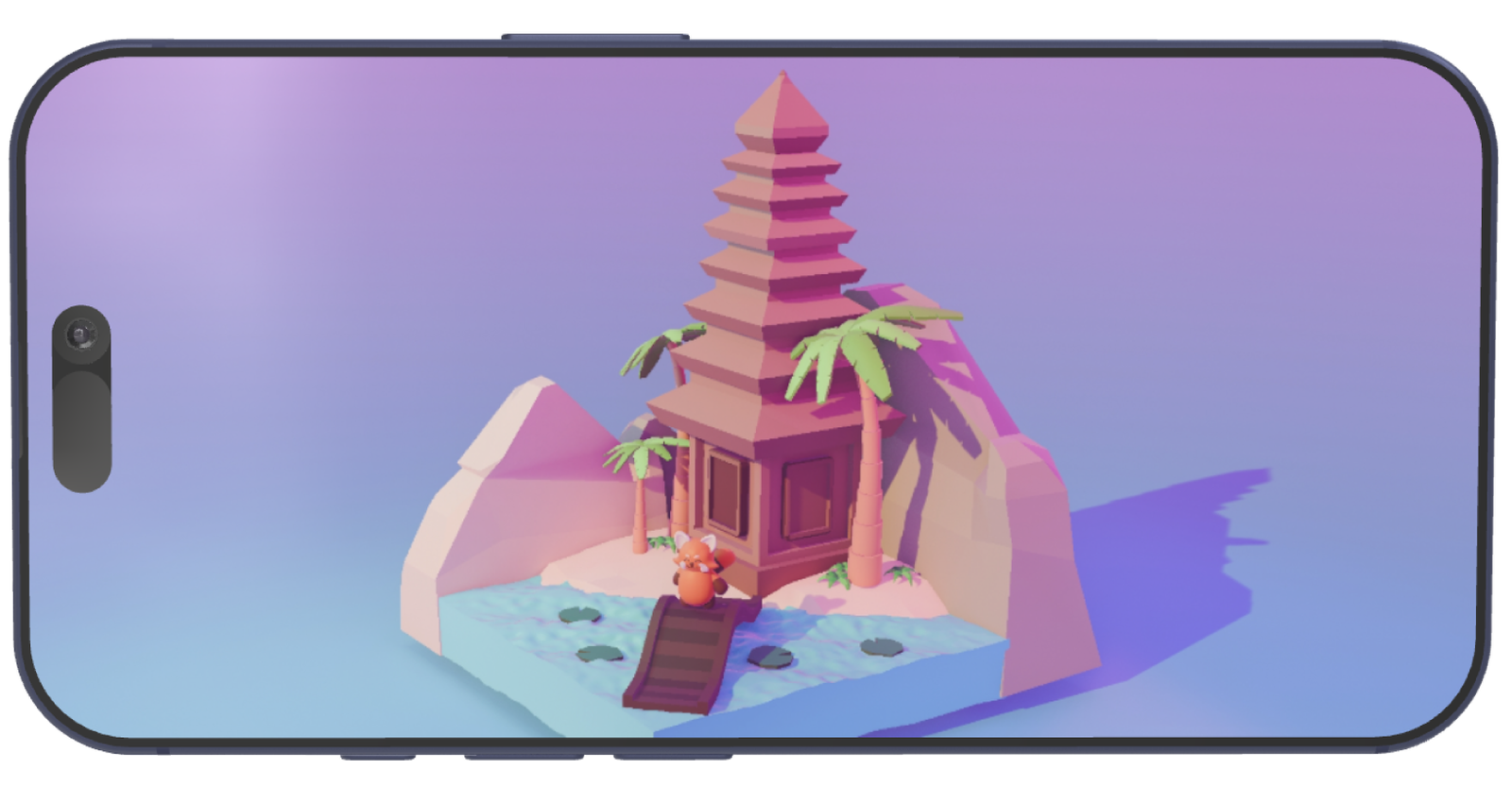
This 3D design project features a low-poly diorama inspired by Indonesian cultural elements. The centerpiece is a traditional temple surrounded by natural elements like water, rocks, and palm trees, creating a serene atmosphere. Alongside the diorama, the project includes a 3D model of a red panda character, which is thoughtfully designed with detailed sketches and multiple perspectives. The intergration of the red panda adds a playful and whimsical touch, complementing the cultural and natural theme. This artwork
highlight the blend of traditional and modern design technique.
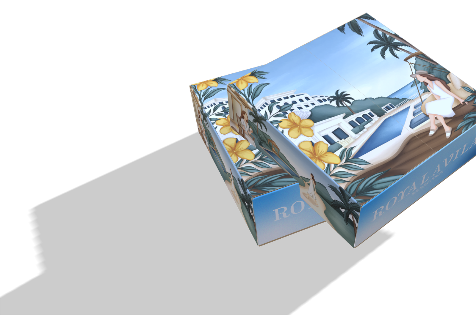
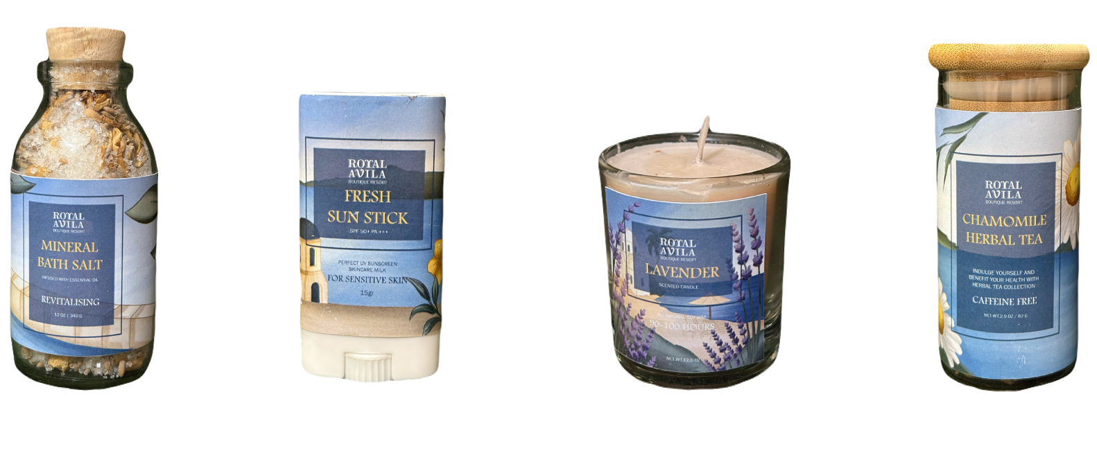
This PR package consists of bath salts,
slippers, scented candle, sun sticks, thank you cards, and infused tea. It was created based on the Royal Avila Boutique Resort with a beach resort theme. I used a door box as if when opening the box you enter the resort vibes with various products that will be given to influencers. On each side of the box, I depicted visitors enjoying the hotel
atmosphere while using the products given. When opening the box, the first thing you will see is a pop-up of activities at the resort.
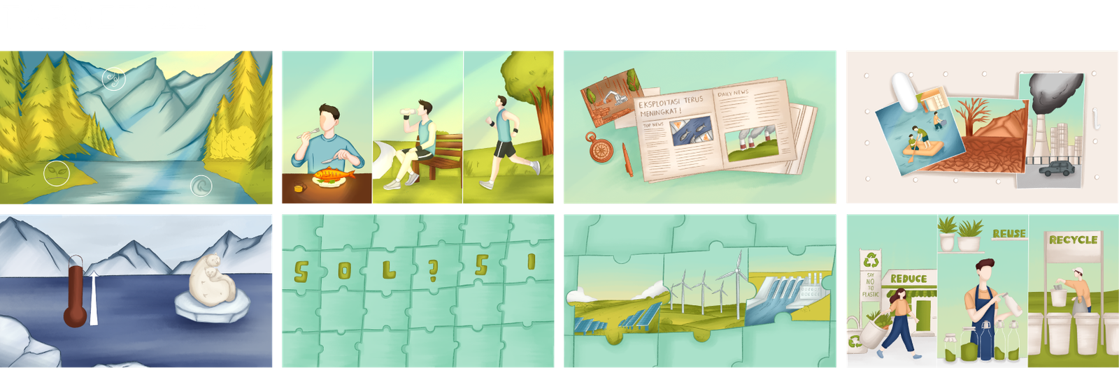
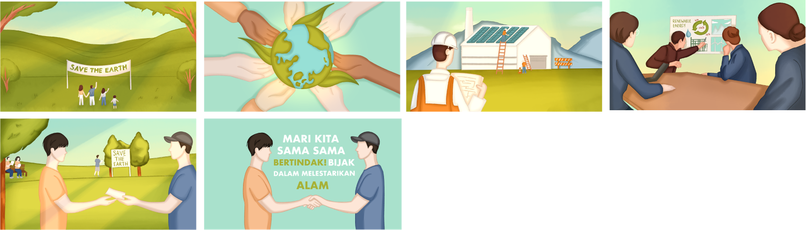
Suistanable management and use of natural resources.
This explainer video illustrates the importance of sustainable management and the responsible use of natural resources.
Through animated storytelling, it highlights how modern lifestyles impact the environment and encourages viewers to take action in preserving nature.
The explainer video uses warm, natural tones and soft illustrations to visualize the impact of human activities on the environment.
Each scene transitions smoothly from nature’s beauty to pollution and then to positive actions like recycling and conservation
creating a clear visual narrative about sustainability. The friendly character style and calm color palette make the message engaging and easy to understand.
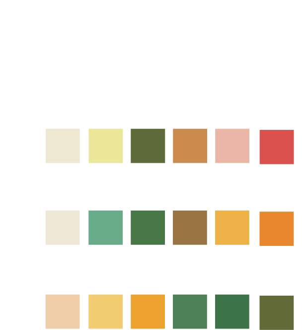
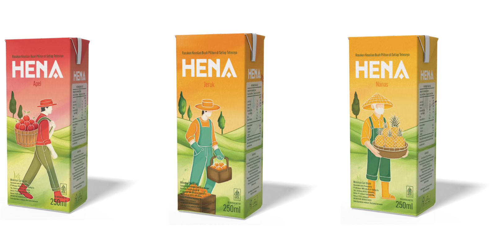
I created a packaging rebranding design for the Hena Juice brand. It features three fruit alternatives: apple, pineapple, and orange. The concept of this design is to highlight the authenticity of the fruit, so I depicted people holding each flavor to represent this.
I also depicted a person enjoying the juice in each alternative.
TOOL | BLENDER, PROCREATECOLOUR PALETTETOOL | CLIP STUDIO PAINTS, PROCREATE, ADOBE ILLUSTRATORSCOLOUR PALETTETOOL | CLIP STUDIO PAINTS, PROCREATE, AFTER EFFECTSCOLOUR PALETTEGAME UIINTERFACE WIN
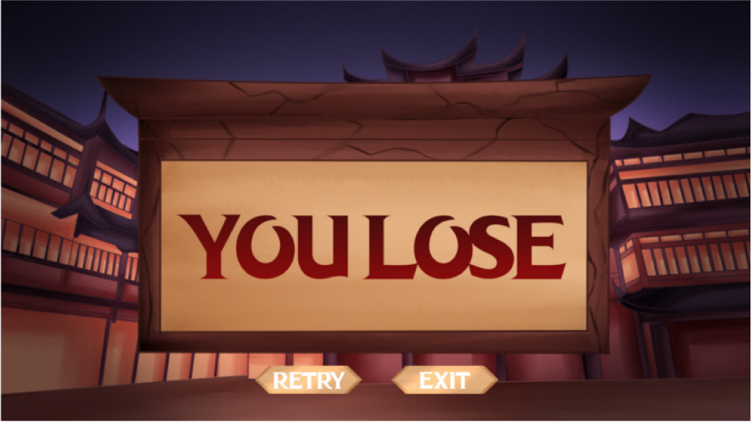
My background is designed to plunge the viewer into a deep, melancholic atmosphere the kind of silence that hits right after losing a game stage. The shadows, the stillness, and the muted color palette echo the sting of failure and the sinking feeling of watching a hard fought run fall apart. It’s a visual reminder of how defeat can linger long after the game ends.


 Hi! I’m a Visual Communication Design undergraduate at Binus University. I’m passionate about exploring how visuals can tell stories, evoke emotions, and connect with people. My works combine creativity and strategic thinking to craft meaningful visual experiences across branding, illustration, and digital media.


 RIDE THE JOY A GUIDE TO BICYCLES
I’M A GRAPHIC DESIGNER
RIDE THE JOY A GUIDE TO BICYCLES
I’M A GRAPHIC DESIGNER


 GAME UIINTERFACE WIN